page  <- 123456789101112131415 -> <- 1 .. 13 .. 15 ->
^^
vv
List results:
Search options:
Use \ before commas in usernames
OMG FLAN!!!!!!!
It's something to do with the palette blend. It happens to me as well, and I don't really know anyway of fixing it, unless you remove the PB blast FX...

Changing the color of the blast might work though.
Green-Kirby, ROAR!
Quote from Sadiztik Fish:
It's something to do with the palette blend. It happens to me as well, and I don't really know anyway of fixing it, unless you remove the PB blast FX...

Changing the color of the blast might work though.

Well I like it so I think I will keep it! :3
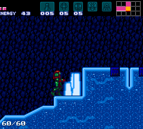
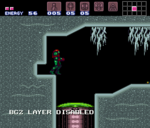
wow. that icey-place picture. it's awesome. mainly because it's abnormal shape makes it look so alien. :D
Green-Kirby, ROAR!

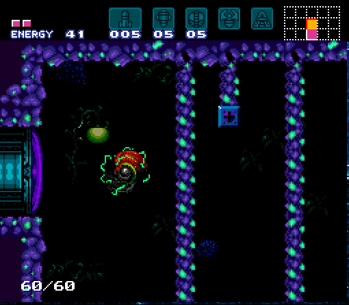
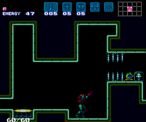
I hope the powerbomb door palette is sexy enough.  Rolling Eyes
(Yes the explosion from a PB have a matching color)
Devonodev: Other D
Have I ever told you that purple is my favourite color?
well, it is.
IMO those dark spots at the very top of every those 3 columns seem to be out of place.

Oh, and that door isn't just sexy, it's hawt!
Green-Kirby, ROAR!
Quote from Gaius_4:
IMO those dark spots at the very top of every those 3 columns seem to be out of place.

Oh, and that door isn't just sexy, it's hawt!

They are holes, in a room with a bit more "back ground" to it then you could see that better.
Edit history:
Crys: 2009-05-11 03:34:34 pm
Green-Kirby, ROAR!


Compare to how it looked like befor and tell me what you think.
the metroid is a lie !
imo, the old one was better, it looked more natural, whereas that just looks like a really cold spaceship<<< the reason i say that is that my tiles are similar that im using in sm:x so... yea stick with the old one.
OMG FLAN!!!!!!!
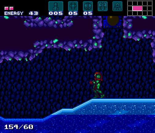
I love the thrid pic. The second one seems a bit empty, but that's probably because I think every room should have some kind of effects.

I'm guessing it has water in it though?

If only you could have water AND another FX like fog or something, and the fog would just stop at the water level.
^/_\^
I really like the new pics better i think it look a lot cooler.
Green-Kirby, ROAR!
I'm just going to let you guys know that my blog is now finally up and running again (well sort off)
I will have to recode it again but that's okay.

I will start posting content on it some time next week!
You can find the new blog url here: http://gk.metroidconstruction.com/

My new host is GF_kennon, many thanks to him.

I will post screens and videos on my forum topics but for back story or general info about both this hack and future hacks check out the blog!
Edit history:
Crys: 2009-05-31 06:22:48 am
Green-Kirby, ROAR!
Blog is up and working BTW!

Also take this video where I make a room:

Here is how the done room looks like in game:


Edit:
I don't want to bump the topic as the interest for this type of thing is low... but here is another video in the same style:
Green-Kirby, ROAR!
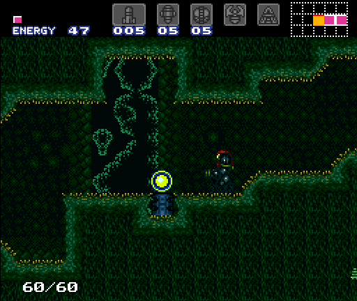
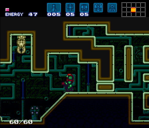
Some palette update for most areas was done. The only thing that matters are the two areas I have showed befor so I made two screen shots.


Is it better, worse, or?
Edit history:
Gaius_4: 2009-06-04 10:53:54 am
The last pic, in the bottom left...  The slope cuts off before it reaches the floor.  I'm going to assume you did that on purpose...  Just...  Why?

Other than that I like the way the rest of it looks.  And the first pic.  That looks fuzzy, like you could lie down and take a nice nap.

edit: I only got 2:27 into the 2nd movie before I gave up hope.
XEL NAGA from CHOZO? ADUN TORIDAS
yea awesome Very Happy

what's the song name ?? (in the 2nd video)
Edit history:
Crys: 2009-06-06 10:50:31 am
Green-Kirby, ROAR!

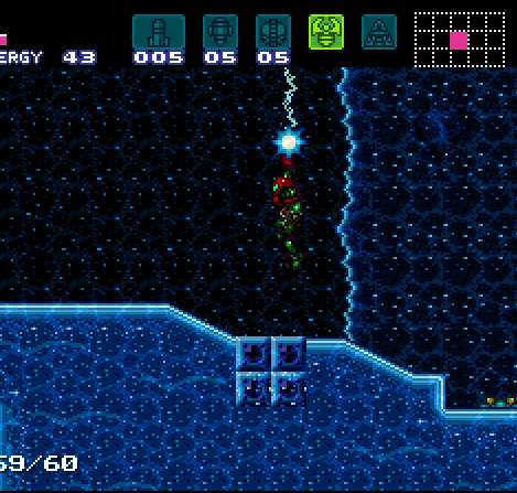
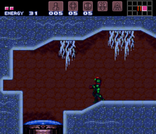
With the new tile build I can use 3 palettes for the ice tiles as they are in 3 tile sets.
I'm sure you can guess what tile set this is so...

Also this palette is kinda beta as IMO it looks shit ugly.


Quote from shinlvl2darkchozo:
yea awesome Very Happy

what's the song name ?? (in the 2nd video)

Click on the video and go to youtube and see vid description.

Edit:
IMO, the red background looks kinda ugly with the blue foreground. Also, awesome looking suit.
^/_\^
Looks good, the only thing is see that could be better is a maybe a different color for those vines hanging from the ceiling(a darker blue perhaps).
Blue greenish vines, is it possible?

PD: wow I came back, been away forever from this forum, and I saw this topic and though "hmm maybe its finished" D:

Hope its going ok though!
Green-Kirby, ROAR!
...  :O

THAT KIRBY STOLE MY SUPER MISSILE!
>:(
Go ahead. Stare.
I like that without a BG. The darkness of the pallete and the plain tiles makes it look really good without anything. Sometimes, it is nice to see something completely uncomplicated.
Green-Kirby, ROAR!
Quote from MetroidMst:
I like that without a BG. The darkness of the pallete and the plain tiles makes it look really good without anything. Sometimes, it is nice to see something completely uncomplicated.

It has a garblaged BG so I removed that layer. But good point I might end with not using a BG at all in this room!
MM has a good point, now that I think about it, I was never bothered by the fact that there was no background.
now.. how do we painlessly rob that kirby? hmm...
Personally I disagree; a solid color BG always looks like something is missing, unless the game's graphics are sub 8-bit in style, and graphical consistency is much more important than what quality you're using IMO.  A simple, subtle BG would be fine, though.