12 ->
^^
vv
List results:
Search options:
Use \ before commas in usernames
Anywhere, everywhere


Link
Thread title: 
very nice  Shocked
What he said...  laugh new

As someone in the link said, definitely not what I expected to see.
...

what?

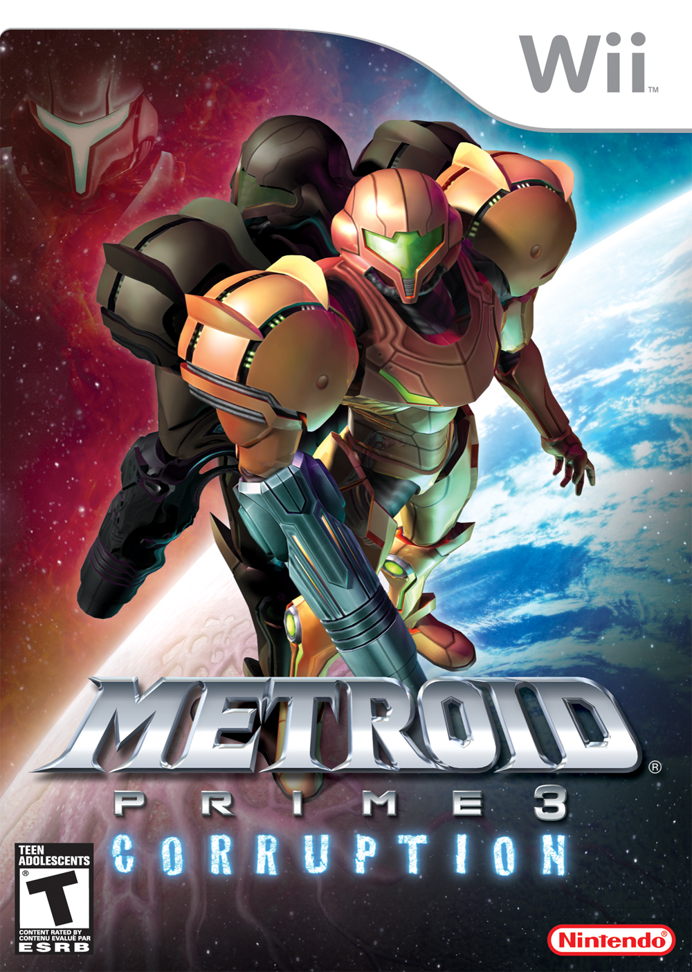
So we have Samus standing there with what I can only assume to be Samus in corrupted mode behind her. But it's just the same Samus model, but darker <_<, which (I hope) is vastly different from the design of the actual corrupted Samus.

We also have Dark Samus's face floating in space for no reason... yeah.

And it seems to be divided into light and dark, with light being on the right (represented by blue >_>) and dark on the left (represented by red <_<). Now either they're pulling the same stupid dark/light crap they did in MP2, or it's just a "stylistic" thing that makes no sense...
Anywhere, everywhere
Yeah, it's not exactly the best box I've ever seen (to put it nicely), but then again, Prime and Echoes aren't the greatest boxes either.

That honor goes to Metroid II. grin new

Quote from Dragonfangs:
And it seems to be divided into light and dark, with light being on the right (represented by blue >_>) and dark on the left (represented by red <_<).

You would think that it would be opposite, wouldn't you, with Samus having a reddish suit and Phazon being blue, but whatever. It's just a box...
(user is banned)
it looks like something i could easily make with photoshop.  and photoshop hates me.

Just how many times do we need floatyfaces on boxarts?  JEEZ.

and red is so much more badass than blue.


Metroid Prime's boxart wins with its simplicity.

if they do more light/dark shit, i am shooting myself.  No jokes.  I'll even make a video for youtube of it.
The reflected arm cannon on her hip and waist is pretty nifty.  She sure keeps her suit polished and shiny!

The Samus in back has the colors one might expect from an Ing possessed individual.  The parts closest to Samus are warped as if made of Ing goo.

The spikey font is a new one for the series, first seen with the May 22 press release.  It uses a different font for "PRIME" than the other Primes.

It's hard to look at DS in the corner and not be reminded of Kridly's avatar.
I agree, that the original Prime cover beats this one by a lot, but I still like this new one for Corruption.

I like the symbolism of the two suits in the center, even though it is used quite often in media: The inner conflict between good and evil choices. And, in a way, that can sort of explain the difference between Samus and Dark Samus. (Or in this case, between normal and corrupted Samus, since she's on the cover twice.) Either that, or I'm looking too much into this, because that's the best thing I can come up with for explaining the blue and red background.

I'm sure that, within two months of the game coming out, we would know if the Light and Dark elements from Echoes are returning, seeing as how it would be a big part of the game if it were true. (And with the beams stacking, how would we get the light and dark beams again anyway?)
(user is banned)
its within two months.
Bananas GOOD, Kremlings BAD
As long as Dark Samus is alive, there'll be a light/dark theme present in some capacity.
always move fast
fake samus is melting. =O
I meant, seeing as the game is only two months away, you'd think we know if something as important as the Light and Dark world elements from Echoes is now part of Corruption as well.

And since we haven't heard about it, I'd assume that they aren't involved in the game at all and it's just a creative choice for the cover.
red chamber dream
Looks like flickerbatting Spider-Man 3. And by that I mean crap.

Also, Prime I has the best cover art of all time. Nothing else could fit that game so well.
Anywhere, everywhere
Quote from Arkarian:
Also, Metroid II: Return of Samus has the best cover art of all time.

I completely agree.

>_>
Strategy Guide Writer
What's the bets that that boxart indicates that the corrupted samus is in fact - Dark Samus itself, only projected outwards (or something equally ludicrous). And the Phazon exposure in the previous games are what caused the 'outward projections'.  laugh new  laugh new

Or it could always be a 'dream sequence' and Samus wakes up with none of it ever really happening...  Wink

Oh, and that box art is completely devoid of any artistic flair and doesn't appeal at all. No doubt the Japanese will get a MUCh better looking cover design...  Rolling Eyes
This is even worse than the boxart of MP2 ... :<
l'appel du vide
Horrible.
Bananas GOOD, Kremlings BAD
So, no warm and fuzzies, huh?

I don't think they needed the Dark Samus image on it.  The planet image concept could probably have been stressed a little more.

Then again, I'll probably keep the cover for a week or so before I throw it out and use my CD wallet to store the game...
(user is banned)
lol, I'd laugh if it turned out samus, in being corruptedish, turns like that normally and dark samus took samus' look. :P

thatd be funneh.

It seems that a lot of people do not like this box art.  Many people think DS is another Samus, and there are some photoshops pushing that absurdity.  Looks like the cover may have to go back to the drawing board.

Image 1  - I swear this was posted in this thread at one time.
Image 2
Image 3
(user is banned)
Quote from SkippyJr:

It seems that a lot of people do not like this box art.  Many people think DS is another Samus, and there are some photoshops pushing that absurdity.  Looks like the cover may have to go back to the drawing board.

Image 1  - I swear this was posted in this thread at one time.
Image 2
Image 3


omg.  thats so my avatar.
red chamber dream
What I don't get is why there's no Screw Attack logo or circle of any sort behind the word "Metroid". Just looks totally weird to me.
l'appel du vide
Quote from Andrew Mills:
No doubt the Japanese will get a MUCh better looking cover design...  Rolling Eyes

That's to be expected: they've always looked better.

@Metroid Prime 3 Cover:
bullshit

@Metroid Prime 2: Dark Echoes (JAP) Cover:
best. ever.
Bangaa Bishop
I honestly don't think it's that bad. Not amazing, but not bad. It's still decent enough to grab that random person.